Atheras, Extra Virgin Greek Olive Oil is a family-run business based in Toronto. This brand pours love and tradition into every bottle. From the olive groves, handpicked and cold-pressed all the way to your table.


Approach
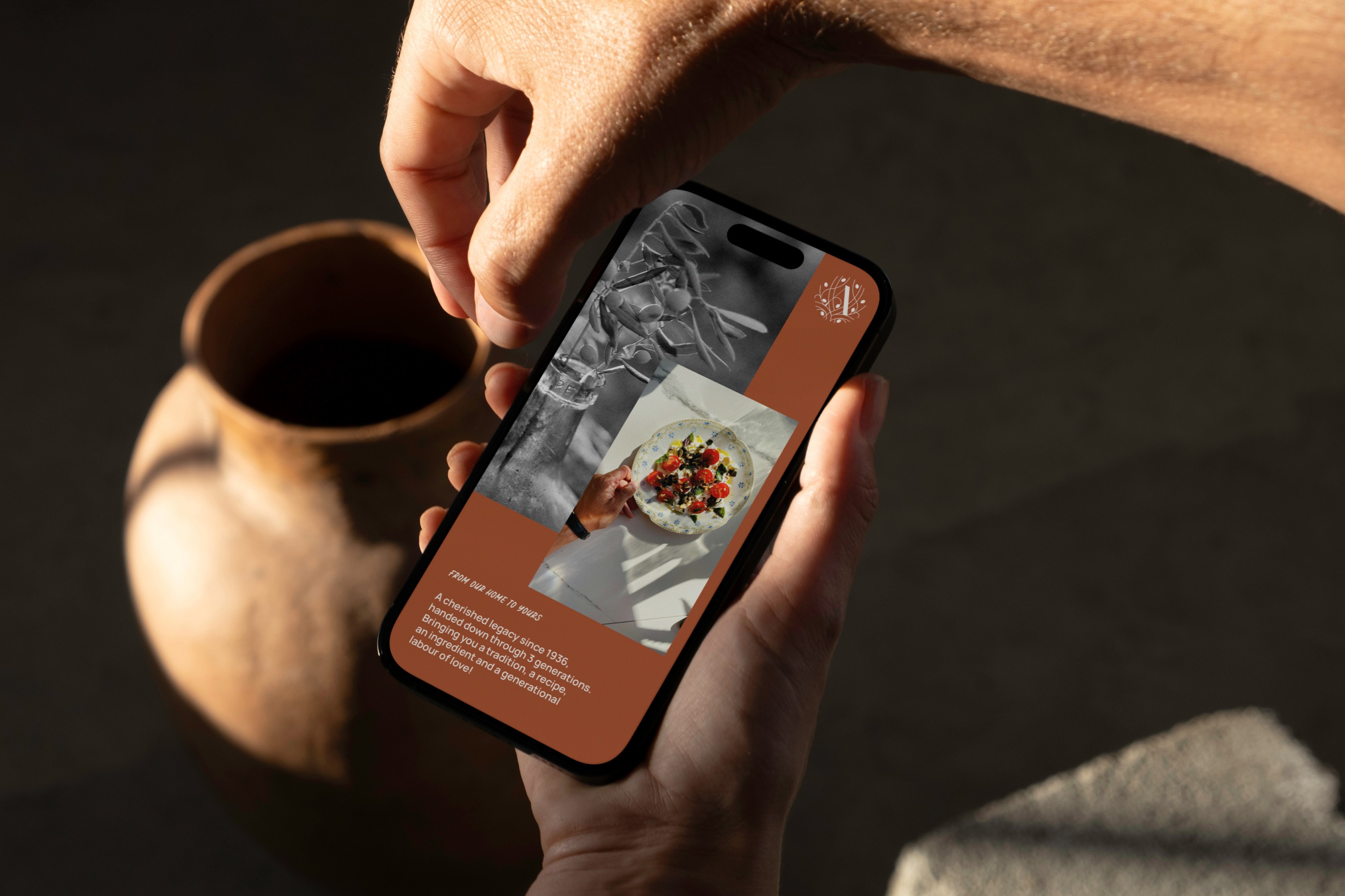
The brand identity exudes a contemporary and crisp aesthetic, steering clear of overly ornate elements to reflect its timeless heritage. This direction aims to enhance a classic and traditional design with a poetic touch. The goal is to elevate the brand's values of elegance, purity, and tradition while standing out in a field where competitors' identities tend toward either dull antiquity or cold minimalism. The idea was to create a brand that is both simple and traditional without leaning too heavily towards either extreme. Regarding packaging, the deliberate choice of a white tin allows the illustration to take centre stage, conveying clear and concise messaging. The Atheras brandmark represents the love and lore of olive oil generation after generation. A cherished tradition since 1936, spanning three generations, it symbolizes more than just a product—it represents a heritage of tradition, recipe, and generational labour of love.


Detail
The supporting artwork depicts a sunset scene with subtle Greek architectural elements, while the colour palette draws inspiration from natural and earthy tones such as soil, olive green, and sky blue. The result is a recognisable system, with a tiny hint of what brings us back home, to elevate the vibe without disconnecting it from its down-to-earth roots.


